

Mobile users now account for over 60% of global web traffic. And most of them won’t wait for a slow site, not even close.
If your site feels sluggish on a phone while loading perfectly fine on your laptop, you’re not imagining the gap. Mobile performance and desktop performance are two entirely different animals, and treating them as the same problem is one of the most expensive mistakes a site owner can make.
Slow load times don’t just frustrate visitors. They kill conversions, suppress search rankings, and quietly drain revenue. Google’s own research shows that 53% of mobile users abandon a site that takes longer than 3 seconds to load. Three seconds. That’s not a high bar, and most websites are failing it.
This guide covers everything you need to actually fix it:
- Why websites load slow on mobile (and not on desktop)
- The most common mobile page speed culprits
- How to diagnose issues using real tools
- Step-by-step mobile optimization
- Core Web Vitals explained and fixed
- Advanced techniques for high-traffic sites
- A quick-action checklist
No padding. No generic advice. Let’s get into it.
Why Is My Website Slow on Mobile?
The short answer: it’s almost never just one thing.
A website typically loads slow on mobile due to a combination of large uncompressed images, heavy JavaScript, poor hosting infrastructure, missing caching, and mobile-unfriendly design decisions. Layer on top of that the fact that mobile devices have slower processors and more unpredictable network connections than desktops, and every existing performance flaw gets amplified.
What most site owners miss is that mobile slowness is a stacking problem. Fix one bottleneck and another one becomes visible. That’s not a bad thing; it just means you need a systematic approach rather than a single fix.
What Actually Happens When Your Mobile Site Is Slow?
The damage goes beyond annoyed visitors. Here’s what slow mobile performance actually costs you:
Higher bounce rates. Mobile users are less forgiving than desktop users. A one-second delay can increase bounce rates by up to 32%. Many visitors leave before your content even finishes rendering.
Lower search rankings. Google uses mobile-first indexing, meaning it evaluates your mobile site to determine where you rank. A slow mobile experience is a direct SEO liability. Learn how this connects to broader ranking factors in our technical SEO audit guide.
Broken trust. Buttons that don’t respond, images that pop in late, layouts that shift mid-scroll: these aren’t just annoyances. They signal to users that your site isn’t worth their time.
Lost conversions. A 2-second delay in page load can reduce conversions by up to 20%. For e-commerce and lead generation pages, that’s not a rounding error; it’s a measurable revenue gap.
In most site audits, the teams with the worst mobile performance are also the ones who only test on desktop. It’s a blindspot that’s surprisingly easy to develop.
Why Is My Website Fast on Desktop but Slow on Mobile?
This is one of the most misunderstood areas of web performance, and it trips up even experienced developers.
Mobile devices have slower CPUs, limited RAM, and handle JavaScript very differently from desktop browsers. A page that feels instant on a MacBook can feel genuinely broken on a mid-range Android phone running on a real 4G connection.
Here’s why the gap exists:
Processing power. Desktop processors are dramatically more powerful than mobile chipsets. JavaScript-heavy pages that parse and execute in 200ms on a desktop can take 1,200ms or more on a smartphone. That’s not an edge case; that’s most of your users.
Memory limitations. A desktop browser can juggle multiple tabs, complex web apps, and large DOM structures without breaking a sweat. A mobile browser is working with a fraction of that RAM. Heavy JavaScript bundles, bloated page structures, and memory-intensive animations cause lag on mobile that simply doesn’t appear on a laptop.
Network conditions. Even on 4G or 5G, real-world mobile network performance involves higher latency, fluctuating signal, and packet loss. A 2MB page that loads in 1.5 seconds on broadband can take 6 to 8 seconds on a real mobile connection. And your Time to First Byte (TTFB), already slower on mobile networks, compounds everything downstream.
Rendering differences. Mobile browsers handle CSS, fonts, and render-blocking resources differently than desktop browsers. CSS effects like heavy animations, filters, and box shadows that are hardware-accelerated on desktop may trigger expensive repaints on mobile. The rendering engine just isn’t the same.
What Google’s Mobile-First Indexing Means for Your Rankings
Since 2021, Google has used mobile-first indexing for all websites. That means Google primarily crawls and evaluates your mobile site to determine rankings, index coverage, and Core Web Vitals scores.
Here’s the part most people overlook: your desktop PageSpeed score is essentially irrelevant to Google’s ranking algorithm. If your Google PageSpeed Insights mobile score is 40 while your desktop score is 90, your rankings reflect the 40.
I’ve seen technically well-built sites lose significant organic traffic because of a single unoptimized hero image above the fold on mobile. The margin for error is smaller than most site owners expect.
The Most Common Mobile Page Speed Issues
Most mobile slowness traces back to a handful of root causes. They compound each other; fixing one often reveals the next bottleneck.
Large Uncompressed Images
This is the single most common finding in mobile speed audits. A 3MB hero image, a product gallery loading full-resolution files, a PNG background image: these are mobile killers.
Mobile screens don’t need the same resolution as a 4K desktop monitor. Serving a 1920px-wide image to a 390px-wide phone screen wastes both file size and rendering time. It’s one of those issues that’s completely invisible on desktop while destroying the mobile experience.
The fix:
- Compress images without visible quality loss using tools like Squoosh or ShortPixel
- Convert to WebP format, typically 25 to 35% smaller than JPEG at equivalent quality
- Use
srcsetso mobile devices receive appropriately sized files - Add
loading="lazy"to below-the-fold images so they don’t delay the initial render
Too Much JavaScript
JavaScript is the heaviest performance cost on most modern websites. Every JS file the browser encounters must be downloaded, parsed, compiled, and executed before the page becomes interactive. On mobile, this process takes significantly longer.
A 500KB JavaScript bundle that executes in 200ms on a desktop can take over 1,200ms on a mid-range Android phone. Common sources of the problem: unused scripts bundled into themes, analytics libraries loading synchronously, multiple versions of jQuery loading simultaneously (extremely common in WordPress), and heavy UI frameworks loading on pages that don’t need them.
Slow Server Response Time
Your hosting determines your TTFB: the time from a user’s browser request to when it receives the first byte of your page. On mobile, where network latency is already higher, a slow server response makes everything else worse.
A good TTFB target is under 200ms. Shared hosting on crowded servers regularly delivers 800ms to 2,000ms TTFB. When your server is that slow, caching plugins and CDNs can only compensate so much. For a deeper look at performance benchmarks, our website performance benchmark study breaks down what “fast” actually looks like across different site types.
Poor Mobile Design Decisions
Many websites are designed desktop-first and adapted for mobile as an afterthought. The result is a site that’s technically “responsive” but still loads the same heavy assets, the same large DOM structures, and the same animation-heavy components on every device.
One thing that catches developers off guard: hiding elements with display:none doesn’t stop them from being downloaded. The browser still fetches those resources; it just doesn’t show them. On a mobile-“optimized” site that hides entire desktop sections, those assets are still loading in the background.
Third-Party Scripts
This is where marketing teams and performance teams tend to clash. Ad networks, live chat widgets, heatmap tools, conversion pixels, social sharing buttons: each one adds HTTP requests and JavaScript execution, and many of them block rendering.
A single chat widget can add 300 to 600ms to mobile load time. A full marketing stack with Google Ads, Facebook Pixel, HotJar, Intercom, and a few analytics tools can add 2 to 4 seconds. I’ve audited sites where third-party scripts accounted for over 40% of total load time.
The honest reality: most sites are carrying scripts they no longer actively use. An audit of your tag manager is often the fastest path to significant mobile speed gains.
Why Is My WordPress Site Slow on Mobile?
WordPress powers over 43% of the web, which makes WordPress-specific mobile performance one of the most common issues in SEO work. The platform’s flexibility, install anything and extend everything, is also its biggest performance liability.
Heavy Page Builders
Elementor, Divi, WPBakery, and similar tools generate enormous amounts of CSS and JavaScript, much of which loads on every page regardless of whether it’s actually used there. Elementor alone can add 300 to 500KB of CSS/JS to a page. On mobile, parsing that extra code has a measurable impact on both load time and interactivity.
This doesn’t mean you can’t use page builders; it means you need to configure them carefully, disable unused modules, and pair them with performance-focused hosting.
Too Many Plugins
Every plugin adds code. Some do it intelligently, loading only where needed. Many don’t. A WordPress site with 40 or more active plugins is almost certainly loading scripts and styles on pages that have no use for them.
Common culprits: slider plugins enqueuing scripts site-wide, contact form plugins loading on every page, WooCommerce scripts appearing on non-shop pages, and multiple SEO plugins running simultaneously. Use Query Monitor or Asset CleanUp Pro to see exactly what’s loading where, then disable assets on pages that don’t need them.
Cheap Shared Hosting
If your site is on shared hosting at $3 to $5 per month, you’re competing for server resources with potentially hundreds of other sites. TTFB will be inconsistent, and during traffic spikes it can get genuinely painful.
The difference between shared hosting and a quality managed WordPress host like Kinsta, WP Engine, or Cloudways is often 600 to 1,200ms in TTFB alone. For mobile performance specifically, hosting matters more than most people realize. If your current setup is holding you back, exploring affordable web design and development options alongside a hosting upgrade can make a significant combined impact.
Poorly Optimized Themes
Theme quality varies dramatically. A premium-looking theme can load 15 or more render-blocking scripts, pull in Google Fonts in a way that blocks rendering, and run legacy jQuery code that hasn’t been maintained in years.
Before blaming your content or hosting, test by temporarily switching to WordPress’s default Twenty Twenty-Four theme and running a speed test. If performance improves significantly, your theme is the bottleneck, not your content.
Real example: A SaaS company’s blog was loading in 7.2 seconds on mobile. After switching from Avada to a lightweight custom theme, reducing plugins from 34 to 18, and optimizing images, mobile load time dropped to 2.1 seconds. Organic impressions increased 34% within 90 days; no hosting changes, no content rewrites.
How to Diagnose Mobile Page Speed Issues
Always test specifically on mobile. Never rely on desktop results to draw mobile performance conclusions. These tools will show you exactly where things are breaking down.
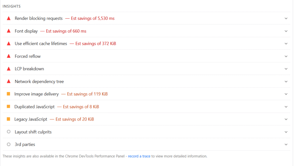
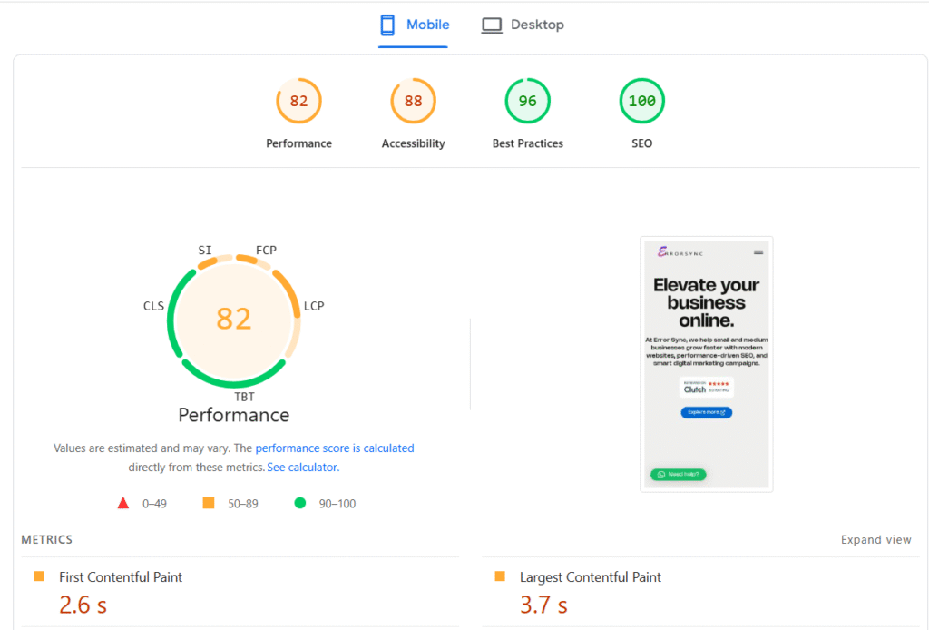
Google PageSpeed Insights
Google PageSpeed Insights is the most important tool for SEO-driven performance work because it uses the same signals Google uses to evaluate your site.
When you run a report, focus on three areas:
Core Web Vitals (Field Data): This is real-world data from actual Chrome users visiting your site. It reflects genuine user experience, not just a lab simulation. The three metrics to watch:
- LCP (Largest Contentful Paint): How long the main content takes to render. Target: under 2.5 seconds.
- CLS (Cumulative Layout Shift): How much the layout unexpectedly shifts during load. Target: under 0.1.
- INP (Interaction to Next Paint): How quickly the page responds to user interaction. Target: under 200ms.
Opportunities: Your prioritized action list. PSI tells you what to fix and estimates potential time savings. Work from highest impact to lowest.
Diagnostics: More granular details: DOM size, render-blocking resources, unused CSS and JavaScript, image sizing issues. This is where you find root causes.
Chrome Lighthouse
Lighthouse, built into Chrome DevTools, gives you a lab-based audit with a simulated mobile connection. To run it properly: open DevTools with F12, go to the Lighthouse tab, select Mobile mode, uncheck everything except Performance, and run the audit in an incognito window so extensions don’t skew results.
GTmetrix Waterfall Analysis
GTmetrix‘s waterfall chart shows exactly when each resource loads, in what order, and how long each one takes. It’s invaluable for identifying which specific files are render-blocking, whether third-party scripts are creating loading bottlenecks, and whether your server response is the primary problem. Set it to test from a mobile connection profile to get results that reflect real-world conditions.
WebPageTest
WebPageTest is the most powerful free tool available for deep-dive performance analysis. It lets you test from real devices, real locations, and specific network conditions. If you want to understand exactly what a mid-range Android phone on a 4G connection experiences when visiting your site, WebPageTest is where you find out.
Step-by-Step Mobile Page Speed Optimization
Approach this systematically: biggest wins first, finer details after.
Step 1: Compress and Optimize Images
Images account for 50 to 70% of total page weight on most sites. This is where the largest gains are.
- Convert to WebP: 25 to 35% smaller than JPEG at equivalent quality. Most modern browsers support it natively.
- Resize correctly: Never serve a 2000px image when the max display size on mobile is 600px. Use responsive images with
srcset. - Compress before upload: Use Squoosh, TinyPNG, or ShortPixel before images ever reach your server.
- Enable lazy loading: Add
loading="lazy"to all below-the-fold images. Do not apply it to your hero image (more on why in the mistakes section).
Step 2: Enable Caching
Caching stores a version of your page so the server doesn’t rebuild it from scratch on every visit. On mobile, where network conditions are less reliable, caching dramatically reduces load time for returning visitors.
For WordPress: WP Rocket, LiteSpeed Cache, or W3 Total Cache are solid options. Configure page caching, browser caching, and object caching. For non-WordPress sites, implement server-level caching through Nginx or Apache, or use a caching layer like Varnish.
Step 3: Minify CSS and JavaScript
Minification strips whitespace, comments, and unnecessary characters from CSS and JS files, reducing file size by 15 to 30% with zero functional impact. Most performance plugins handle this automatically. For custom codebases, UglifyJS and CleanCSS work well in build pipelines.
Also combine CSS and JS files where possible to reduce the number of HTTP requests the browser needs to make on initial load.
Step 4: Tackle Render-Blocking Resources
Render-blocking resources, meaning CSS and JavaScript files that prevent the browser from displaying content, are one of the most impactful performance issues to fix. Our detailed guide on how to fix render-blocking resources in WordPress walks through this step by step if you want a deeper dive.
The core fix: load non-critical JavaScript with async or defer attributes, and delay non-essential scripts like chat widgets and heatmaps until after the page becomes interactive.
Step 5: Implement Lazy Loading
Lazy loading defers images, videos, and iframes until they’re about to enter the viewport. For a page with 20 images, the browser only loads the first 3 to 4 on initial render, which dramatically improves perceived load speed.
Native implementation: <img src="image.jpg" loading="lazy" alt="...">
For more control, the Intersection Observer API lets you define precisely when elements should load.
Step 6: Use a CDN
A Content Delivery Network distributes your static files, including images, CSS, and JavaScript, across a global network of servers. A user in Dhaka receives files from the nearest CDN node rather than a server in the US, which reduces latency significantly.
Cloudflare (free tier is genuinely excellent), BunnyCDN, and KeyCDN are solid options. Many managed WordPress hosts include CDN functionality built in.
Step 7: Upgrade Hosting If Necessary
If your TTFB consistently exceeds 500ms, frontend optimization alone won’t get you where you need to be. At that point, you need better infrastructure.
Move from shared hosting to VPS or managed WordPress hosting, choose a host with server-side caching via LiteSpeed or Nginx, and pick a host with data centers close to your primary audience. For serious traffic, cloud infrastructure becomes worth the cost.
The workflow that works: fix images first, implement caching, address render-blocking resources, audit third-party scripts, measure, then address hosting if TTFB is still the bottleneck.
Core Web Vitals Mobile Optimization
Google uses Core Web Vitals as direct ranking signals. Failing them on mobile isn’t just a performance issue; it’s an SEO issue.
Improving LCP (Largest Contentful Paint)
LCP measures how long the largest visible element, usually your hero image or main headline, takes to render. Poor LCP means users are staring at an empty page.
Common mobile LCP culprits: large hero images without WebP conversion, slow server TTFB pushing everything downstream, render-blocking CSS, and this one is very common, lazy loading applied to the LCP image itself.
Fixes:
- Preload your LCP image:
<link rel="preload"> - Host the LCP image on your own server, not a third-party CDN that adds DNS lookup time
- Ensure the LCP element is in the initial HTML, not injected by JavaScript after load
- Improve TTFB through better hosting and server-side caching
Fixing CLS (Cumulative Layout Shift)
CLS measures how much elements move around on screen during load. On mobile, this is often worse than desktop because elements reflow differently in narrow viewports. Ad-heavy sites are typically the worst offenders; dynamically loaded ad units combined with lazy-loaded content creates a layout that shifts multiple times before stabilizing.
Common causes: images without explicit width and height attributes, ad slots that expand after content loads, web fonts causing text reflow when they swap in, and cookie consent bars injected at the top of the page.
Fixes:
- Define image dimensions in HTML:
width="800" height="600" - Reserve space for ad slots with explicit container dimensions
- Use
font-display: optionalor preload web fonts to prevent font swap shifts - Load dynamic content from the bottom of the page, not the top
A mobile CLS score above 0.1 is a red flag worth investigating immediately.
Optimizing INP (Interaction to Next Paint)
INP replaced FID in March 2024. It measures how quickly your page responds to all user interactions: taps, clicks, keyboard inputs, not just the first one. On mobile, poor INP is almost always caused by long JavaScript tasks blocking the main thread.
Fixes:
- Break up long JavaScript tasks using
setTimeoutorscheduler.yield() - Defer non-critical JS until after the page is interactive
- Audit your event listeners; some frameworks attach them inefficiently
- Use Chrome DevTools’ Performance tab to identify long tasks (anything over 50ms is worth investigating)
Advanced Mobile Performance Techniques
These techniques are typically applied by larger sites or those chasing top-tier Core Web Vitals scores after the basics are already solid.
Resource Prioritization
You can explicitly tell the browser which resources matter most:
<link rel="preload">: Forces the browser to fetch critical resources like fonts, LCP images, and key scripts early<link rel="preconnect">: Establishes early connections to third-party domains to reduce DNS and handshake delaysfetchpriority="high": Added directly to your LCP image to signal it should load first
Small changes. Meaningful impact, especially on mobile where every millisecond stacks.
Critical CSS
Critical CSS extracts the minimum CSS needed to render above-the-fold content and inlines it directly in the <head>. The rest of your stylesheet loads asynchronously.
This eliminates render-blocking CSS for the initial viewport; the page starts painting immediately while the full stylesheet loads in the background. Tools like the Critical npm package and PurgeCSS help automate the process.
Server-Side Rendering
If your site uses React, Vue, or a similar JavaScript framework, client-side rendering requires the browser to download and execute JavaScript before anything appears on screen. On mobile, this creates a significant blank-screen delay.
Server-side rendering generates HTML on the server and delivers a fully rendered page to the browser, dramatically improving LCP and perceived load speed. Next.js and Nuxt.js make this relatively straightforward for teams already using these frameworks.
Edge CDN
Traditional CDNs cache static files. Edge CDNs like Cloudflare Workers go further; they run logic at the CDN level, close to the user, rather than routing every dynamic request back to your origin server.
For large-scale sites, edge caching can reduce TTFB to under 50ms globally. Personalized pages, A/B tests, and server-side rendering can all execute at the edge, eliminating the distance penalty that particularly hurts mobile users on slower networks.
Mobile Speed Fix Checklist
Use this as your starting framework, then let Google PageSpeed Insights prioritize what matters most for your specific site.
- ☐ Run Google PageSpeed Insights on your key mobile pages
- ☐ Compress all images and convert to WebP
- ☐ Add
loading="lazy"to all below-the-fold images - ☐ Preload your LCP image with
<link rel="preload"> - ☐ Enable page caching (WP Rocket, LiteSpeed Cache, or server-level)
- ☐ Minify and combine CSS and JavaScript files
- ☐ Load all third-party scripts with
asyncordefer - ☐ Remove unused plugins, scripts, and CSS
- ☐ Set explicit
widthandheighton all images (fixes CLS) - ☐ Install and configure a CDN (Cloudflare free tier is a solid start)
- ☐ Check your TTFB; if over 500ms, address hosting
- ☐ Preload or self-host Google Fonts to eliminate render delay
- ☐ Test on a real mid-range Android device, not just DevTools simulation
- ☐ Verify Core Web Vitals pass in Google Search Console
Common Mobile Optimization Mistakes
These are the mistakes that come up most often in audits, and the ones most likely to undo the good work you’ve already done.
Only testing in DevTools. Chrome’s device emulation is useful but imperfect. Real mid-range Android phones on real 4G connections consistently show worse results than any lab tool suggests. If you only test on a simulator, you’re testing in conditions your average user doesn’t have.
Lazy loading the hero image. This one comes up constantly. Developers apply lazy loading to all images globally, including the main image above the fold. This directly delays your LCP score, which is a confirmed ranking factor. Your hero image should never be lazy loaded.
Overbuilding with page builders. Page builders produce bloated HTML, inline styles, and excess JavaScript. For performance-sensitive pages, especially landing pages, consider clean HTML/CSS or a lightweight alternative. If you’ve run into broader issues because of plugins or page builder conflicts, our guide on how to fix critical errors in WordPress without developer help covers the recovery process.
Loading Google Fonts incorrectly. A standard <link> tag for Google Fonts is render-blocking by default. Self-hosting your fonts and using font-display: swap eliminates this bottleneck entirely. It’s about a 10-minute fix that regularly saves 300 to 600ms on mobile.
Treating optimization as a one-time task. Page speed degrades over time as you add content, plugins, and scripts. Build performance testing into your regular workflow: quarterly audits at minimum, or automated monitoring using tools like SpeedCurve or Calibre.
Chasing the score instead of the experience. A PageSpeed score of 90 doesn’t automatically mean your site loads fast for real users. Field data, the CrUX data in PageSpeed Insights, always matters more than lab scores. A score of 75 with passing real-world Core Web Vitals is more meaningful than a lab score of 95 with failing field data. Always prioritize what your actual users experience.
When Optimization Isn’t Enough
Sometimes there’s no workaround. If your site is built on a legacy platform generating 400 or more database queries per load, or your shared hosting has a structural TTFB ceiling, optimization plugins become band-aids on a deeper wound.
Legacy architecture issues. Caching helps, but it doesn’t fix underlying architectural debt. Some platforms simply weren’t built for the performance expectations of 2025.
Shared hosting limits. There’s a hard ceiling on what shared hosting can deliver regardless of how optimized your frontend is. No CDN or image optimization eliminates a fundamentally slow origin server.
Poorly built themes. Some themes generate 300 to 400 DOM nodes per component and load JavaScript libraries that haven’t been updated in years. Optimization plugins can compress and defer some of it; they can’t fix bad architecture.
In these cases, the honest recommendation is to rebuild or migrate rather than optimize further. The cost of a proper rebuild typically pays for itself within a year through improved conversion rates and SEO performance. If you’re considering that path, our guide on affordable web design and development for small businesses is worth reading before you start scoping work.
FAQ: Why Your Website Loads Slow on Mobile
Why is my website slow on mobile but fast on desktop?
Mobile devices have slower processors, less RAM, and less reliable network connections than desktops. JavaScript that executes in milliseconds on a laptop can take several seconds on a mid-range smartphone. Desktop speed is not a reliable indicator of mobile performance; always test both separately using PageSpeed Insights.
How can I improve mobile website speed quickly?
The fastest gains almost always come from four places: compressing and converting images to WebP, enabling page caching, deferring or removing unused JavaScript, and self-hosting Google Fonts. These four changes alone can improve mobile load time by 2 to 4 seconds on most standard sites.
Why is my WordPress site slow on mobile?
Usually a combination of a heavy theme, too many plugins loading scripts site-wide, large unoptimized images, and inadequate hosting. Start with hosting, implement WP Rocket or LiteSpeed Cache, optimize images, and audit which plugins are loading assets unnecessarily. Our technical SEO audit guide includes a full performance section if you want a structured process.
How do I fix a slow loading mobile website?
Run Google PageSpeed Insights on your mobile pages, work through the Opportunities section from highest to lowest impact, address images first as they carry the most weight, then tackle render-blocking resources, third-party scripts, and finally hosting if TTFB remains high.
Does mobile speed affect Google rankings?
Yes. Google uses mobile-first indexing and Core Web Vitals as confirmed ranking signals. A slow mobile site won’t automatically tank all rankings, but it’s a real disadvantage, particularly in competitive niches where other ranking factors between you and a competitor are roughly equal.
What is a good mobile PageSpeed score?
Google considers 90 to 100 as Good, 50 to 89 as Needs Improvement, and below 50 as Poor. That said, a score of 70 to 75 with passing Core Web Vitals in real field data is more meaningful than a lab score of 95 with failing real-world metrics. Always prioritize field data over the number.
Final Thoughts
Mobile performance is no longer optional. It’s a direct input into your search rankings, user experience, and conversion rates, and the gap between fast and slow sites keeps widening.
The good news is that most mobile speed problems are fixable without a complete rebuild. Images, caching, render-blocking resources, and third-party scripts account for the majority of mobile slowness across most sites. You don’t need a perfect setup; you need a systematic approach and the right tools.
Start with a Google PageSpeed Insights mobile audit today. Work through the opportunities in priority order. Verify your Core Web Vitals in Google Search Console. And test on a real device before you call anything done.
Speed is one of the few investments in your site that pays dividends across SEO, UX, and revenue simultaneously. It’s worth doing right.