
Discover the 7 C’s of Effective Website Design
Every brand needs a website that works. But what separates a website that just exists from one that actually helps your business grow?
The answer lies in understanding the 7 C’s of effective website design. These seven pillars act as your roadmap to building a site that visitors love and search engines reward. Whether you’re about to create a website from scratch or improve your current one, the 7 C’s provide a clear framework that covers everything from content to commerce.
Think of modern website design as a puzzle. Each piece matters. Miss one, and the whole picture suffers. Following this guide, you’ll discover how these simple principles work together to create websites that convert visitors into loyal customers.
What Are the 7 C’s of Effective Website Design?
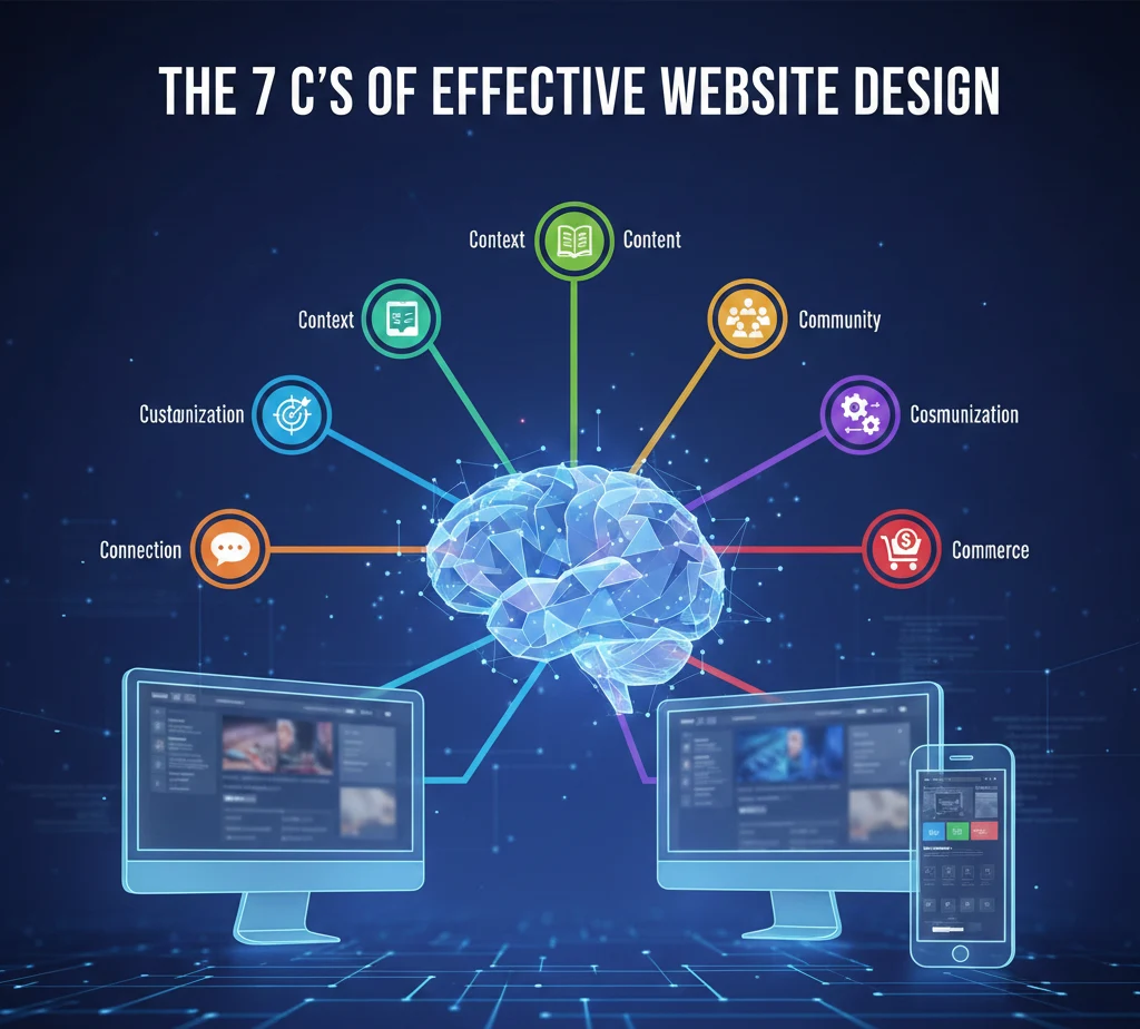
The 7 C’s of effective website are seven core principles that define what makes a website truly work. Let’s break them down:
- Content – The words, images, and information you share
- Context – How everything is organized and presented
- Community – Building trust through real user interaction
- Customization – Making the experience feel personal
- Communication – Keeping conversations clear and easy
- Connection – Linking your site with other platforms
- Commerce – Making transactions smooth and secure
Why does effective website design is essential for your business? Because your website is often the first impression customers get. A strong online presence built on these c’s of effective website design helps you build trust, improve customer experience, and drive real engagement and conversion.

This framework isn’t just theory. Businesses using these principles see better results because they’re designing websites that put users first. The 7c’s of website design give you a checklist to ensure nothing important gets overlooked.
C1: Content – The Foundation of Every Website
Content is where everything starts. Without clear, helpful information, even the most beautiful website falls flat.
High-quality content does several things at once. It answers questions your visitors actually have. It helps users find what they need without frustration. Most importantly, it makes people want to stay on your site longer.
Your website must communicate value on every single page. When someone lands on your homepage, product page, or blog post, they should immediately understand what you offer and why it matters to them.
Here’s what makes content work:
Clarity first: Write in simple language. If a 12-year-old can’t understand it, simplify it more. Use short sentences. Break up long paragraphs. Make everything easy to read.
Answer real questions: What problems do your customers face? Your content should provide actual solutions, not just promotional fluff.
SEO matters: Good content also helps search engines understand your site. Use keywords naturally. Structure your information logically. This improves your visibility without stuffing keywords everywhere.
The best content doesn’t feel like marketing. It feels like a helpful friend explaining something useful. That’s when visitors turn into customers.
C2: Context – Layout, Structure & Purpose
Context means everything is in the right place for the right reason. Your layout directly affects how users experience your website.
Think about walking into a grocery store. You expect fruits and vegetables near the entrance, not in the back corner next to cleaning supplies. Websites work the same way. The overall visual and functional design should match what visitors expect from your brand.
Layout isn’t just about looks. It’s about making information flow naturally. Your design choices affect whether someone stays on your site or clicks away in confusion. When you’re designing a website, ask yourself: “Does this make sense to someone seeing it for the first time?”
Good context means:
Consistency in design throughout your website: Your header shouldn’t change drastically from page to page. Colors, fonts, and button styles should feel familiar as visitors move around.
Purpose-driven structure: Every element should have a reason for being there. That banner image? It should reinforce your message, not just look pretty.
Brand alignment: Your design should reflect who you are. A law firm needs a different feel than a skateboard shop. Make sure your layout supports your brand identity, not fights against it.
Poor context creates confusion. Great context creates confidence. When visitors understand where they are and where to go next, they stick around longer.
C3: Community – Building Interaction & Trust
People trust other people more than they trust companies. That’s why community is one of the most powerful c’s of effective website design.
Community isn’t about building a forum (though that can help). It’s about showing real proof that real people use and love what you offer.
Build trust by featuring:
Testimonials and reviews: Let happy customers tell their stories. Nothing convinces a potential buyer like hearing from someone who already bought and loved it.
Social proof: Show how many people subscribe to your newsletter, bought your product, or follow your brand. Numbers create confidence.
User interaction spaces: Comment sections, Q&A areas, or even a simple feedback form show you care about what customers think.
This help your business in ways you might not expect. When people see others engaging with your brand, they feel safer joining in. Community spaces also give you valuable feedback that helps you improve your products or services.
Your marketing strategies should include ways to encourage and showcase community. Share user-generated content. Respond to comments. Show that there are real humans behind your website.
A strong community doesn’t happen overnight, but it’s worth building. It turns one-time buyers into brand advocates who bring others along.
C4: Customization – Personalizing the Experience
Nobody wants to feel like just another number. Customization makes your website feel like it was built specifically for each visitor.
When you allow users to personalize their experience, you create trust and familiarity. Even small choices make a big difference.
Simple ways to customize:
Remember preferences: If someone selects a language preference or currency, remember it for next visit. Don’t make them choose again.
Personalized recommendations: “Based on your browsing, you might like…” This shows you’re paying attention to what matters to them.
Flexible options: Let users adjust text size, toggle between light and dark mode, or customize their dashboard view.
The website needs to align with different user preferences because your visitors aren’t all the same. Some want detailed information. Others want to jump straight to checkout. Great websites accommodate both.
Customization doesn’t mean rebuilding your entire site for each person. It means creating options that allow users to shape their own experience. This makes them feel valued and understood.
When done right, customization increases engagement. People spend more time on sites that feel tailored to them. They’re also more likely to return because the experience feels uniquely theirs.
C5: Communication – Keeping Things Clear & Easy
If visitors can’t reach you when they need help, you’ve lost them. Effective communication means making every interaction simple and clear.
Your website must offer multiple ways for people to connect:
Contact forms: Keep them short. Ask only what you truly need. Nobody wants to fill out 15 fields just to ask a question.
Live chat: For urgent questions, real-time help prevents abandonment. Even a chatbot that answers common questions helps users find what they need faster.
Call to action buttons: These should be impossible to miss. “Buy Now,” “Get Started,” “Contact Us” – make them stand out with contrasting colors and clear wording.
Navigation is also part of communication. Your menu structure should make sense at a glance. If someone wants to find your pricing page, they shouldn’t need to hunt through five different menus.
The layout of each page should guide visitors naturally toward the next step. Where do you want them to go after reading this section? Make that path obvious.
Good communication also means writing in a way that everyone understands. Skip the jargon. Use familiar words. If you must use technical terms, explain them simply.
When visitors can make a purchase without confusion, when they can find answers without frustration, when they can reach you without giving up – that’s when communication succeeds.
C6: Connection – Integrating Tools & Platforms
Your website doesn’t exist in isolation. Connection refers to how well your site links with everything else you use to run your business.
Strong connections help your website work smarter:
Social media integration: Add share buttons. Embed your Instagram feed. Make it easy for visitors to follow you across platforms. This expands your reach beyond just your website.
CRM systems: When someone signs up for your newsletter, that information should flow directly into your customer management system. No manual data entry needed.
Analytics tools: Connect Google Analytics, heat mapping software, or other tools that help you understand how visitors use your site.
Payment processors: For e-commerce, seamless integration with payment systems makes checkout smooth and secure.
These connections help your website work as part of a larger ecosystem. They improve SEO by creating signals that search engines value. They boost engagement by making it easier for people to interact with your brand wherever they prefer.
Links on your website should be trustworthy and relevant. Every external link should add value. Broken links destroy trust and hurt your search engine rankings.
Good integration also means your website responds to other systems. When you post on social media, can people click through to relevant pages? When someone emails you, can they easily find your website to learn more?
Think of your website as the hub of a wheel. Every connection is a spoke linking you to another platform or tool. The stronger those connections, the more powerful your overall online presence becomes.
C7: Commerce – Smooth, Simple Transactions
If you sell anything online, commerce is make-or-break. Even the best products won’t sell if the buying process feels risky or complicated.
Shopping online should feel safe and effortless. Here’s what that means:
Clear checkout process: Show exactly what steps remain. “Step 2 of 3: Shipping Information” reduces anxiety because people know what to expect.
Multiple payment options: Some prefer credit cards. Others want PayPal or Apple Pay. Offer choices that cover most preferences.
Security signals: Display trust badges. Use SSL certificates (the little padlock in the browser). Explain how you protect customer data.
Mobile-friendly checkout: Most people browse on phones. If your checkout doesn’t work well on mobile, you’re losing sales every single day.
Your successful website checkout flow should minimize friction. Don’t ask for information you don’t need. Auto-fill what you can. Save cart items so people can return later without starting over.
Design creates confidence. Professional-looking checkout pages with clear information make people comfortable entering payment details. Amateur-looking pages make them nervous and likely to abandon their cart.
Even if you don’t sell products directly, commerce principles apply. If you want people to book appointments, sign contracts, or commit to services, make that process smooth. Remove obstacles. Make the next step obvious.
When commerce works well, it turns curious visitors into paying customers. When it’s clunky, it sends them straight to your competitors.
The Role of Website Design in Branding & Trust
Your website design tells visitors who you are before they read a single word. It shapes their entire impression of your brand.
A beautiful website does more than please the eye. It builds instant trust. When people see a professional design, they assume the business behind it is equally professional. Fair or not, that’s how human psychology works.
Consider the opposite: a poorly designed website destroys credibility immediately. Mismatched colors, broken layouts, confusing navigation – these signal that the business doesn’t care about details. If you can’t maintain your website, why should anyone trust you with their money or information?
Your overall design should reinforce your brand identity consistently. Every color choice, every font, every image should align with who you are and what you value.
Design as well as functionality need equal attention. A site that looks amazing but doesn’t work is just as bad as one that works but looks terrible. The best websites nail both.
Think about brands you trust. Their websites probably feel polished, coherent, and thoughtfully made. That’s not accident. Those design choices create emotional responses that lead to business results.
Your website looks matter because first impressions form in milliseconds. You don’t get a second chance to make that initial impact count.
Layout, Navigation & User Experience Best Practices
Great user experience keeps people on your site. Poor experience sends them away, often never to return.
The right layout makes everything feel natural:
Visual hierarchy: Important information should stand out. Use size, color, and positioning to guide attention where it matters most.
White space: Don’t cram everything together. Empty space helps the eye rest and makes content more easy to read.
Intuitive navigation means visitors never wonder where to click next. Your menu should use familiar labels. “Products” not “Solutions Portfolio.” “Contact” not “Connect With Our Team.”
Navigation structure affects whether people find what they need quickly or give up in frustration. Test your navigation with real users. If they get confused, simplify it.
Remember: you’re designing a website for your users, not for yourself. What makes sense to you might confuse them. Always test with people who don’t know your business inside and out.
Best practices to follow:
- Keep important information above the fold (visible without scrolling)
- Make clickable elements obviously clickable
- Use consistent positioning for key elements across all pages
- Ensure compatibility across all devices – desktop, tablet, and mobile
- Test loading speed and optimize images that slow things down
When user satisfaction increases, so do conversions. People who enjoy using your website are far more likely to complete desired actions, whether that’s buying, subscribing, or contacting you.
The goal is simple: make your website so smooth that using it feels effortless.
Responsive & Mobile-Friendly Design
More than half of all web traffic comes from mobile devices. If your website doesn’t work perfectly on phones, you’re losing half your potential audience.
Responsive design means your website automatically adjusts to whatever screen size someone uses. Text remains readable. Buttons stay clickable. Images resize properly. Everything just works.
Mobile-friendly design isn’t optional anymore. Google actually ranks mobile-friendly sites higher in search results. So this affects both user experience and SEO.
To keep your website working across all devices:
Test on real devices: Don’t just resize your browser window. Actually pull out a phone and tablet. Interact with your site the way real users would.
Simplify mobile navigation: Hamburger menus (those three horizontal lines) work well on small screens. Make sure submenus are easy to tap.
Optimize touch targets: Buttons need to be big enough for fingers, not mouse pointers. Too-small buttons create frustration.
Speed matters even more on mobile: People on phones often have slower connections. Compress images. Minimize code. Make pages load fast.
Visual elements need to align differently on mobile. What looks good in three columns on desktop might need to stack vertically on phones.
Following this guide ensures that aspects of the website work beautifully whether someone visits from a laptop at work or a phone on the bus.
Responsive websites don’t just accommodate mobile users – they make mobile users feel like the site was built specifically for them. That’s the standard modern websites must meet.
SEO & Online Presence Factors
Beautiful web design means nothing if no one finds your website. That’s where SEO comes in.
Search engine optimization helps people discover you when they’re looking for what you offer. Done right, it brings consistent traffic without paying for ads.
Key factors that strengthen your strong online presence:
High-quality content: Search engines reward sites that provide real value. Write for humans first, optimize for search engines second.
Site structure: Logical organization helps search engines understand your content. Use clear headings (H1, H2, H3). Create a sensible URL structure.
Speed: Slow sites rank lower. Optimize images, use good hosting, and minimize unnecessary code.
Mobile optimization: Google uses mobile-first indexing. Your mobile experience directly affects rankings.
Internal linking: Connect related pages. This helps visitors and helps search engines map your site.
Meta descriptions and titles: These don’t just affect rankings – they determine whether people click your result.
Tips for businesses: Don’t obsess over algorithm changes. Focus on creating genuinely helpful content and a site that works well. Good SEO follows naturally from good user experience.
You can’t trick search engines anymore. They’re too smart. The best strategy is to ensure that your website serves visitors effectively. When you do that, rankings improve on their own.
Remember that SEO is a long game. Results take months, not days. But the investment pays off with free, consistent traffic that compounds over time.
Your online presence extends beyond your website, but your website is the foundation everything else builds on.
Design Elements & Visual Strategy
The visual elements of your website do more than look pretty. They guide attention, create emotions, and influence decisions.
Key design elements to get right:
Color psychology: Colors trigger feelings. Blue creates trust (why so many banks use it). Orange creates urgency (why you see it on “Buy Now” buttons). Choose colors that align with the emotions you want to evoke.
Typography: Fonts communicate personality. A law firm shouldn’t use the same playful font as a children’s toy store. Choose readable fonts that match your brand character.
Spacing: Proper spacing makes content digestible. Cramped layouts feel overwhelming. Generous spacing feels premium and focused.
Icons and imagery: Use icons to communicate quickly. Use images to connect emotionally. Both should enhance your message, not distract from it.
Consistency: Once you choose your design elements, stick with them throughout your website. This creates a cohesive experience that reinforces your brand.
Your website looks should make people feel something. Professional sites feel trustworthy. Creative sites feel innovative. Budget sites feel… well, budget.
Poor visual strategy undermines everything else. You might have great products and wonderful customer experience, but if the design looks amateur, people won’t give you the chance to prove your value.
Think of visual design as the clothing your website wears. It should fit well, suit the occasion, and make the right impression for who you are and who you’re trying to reach.
Guidelines When Creating a Website (Checklist Section)
Whether you’re planning to create a website or improve your existing one, these guidelines when creating a website will keep visitors engaged and help your business grow.
Content Checklist:
- Does every page clearly explain what you offer and why it matters?
- Is all information accurate and up-to-date?
- Does content use simple language anyone can understand?
- Are there call to action buttons guiding people to the next step?
Design Checklist:
- Is your website design consistent across all pages?
- Do design elements match your brand identity?
- Are images optimized so pages load quickly?
- Does the layout make logical sense?
Technical Checklist:
- Is your site responsive across all devices?
- Have you tested compatibility in different browsers (Chrome, Safari, Firefox)?
- Are all links on your website working properly?
- Is site speed optimized?
User Experience Checklist:
- Can visitors find what they need in three clicks or less?
- Is navigation clear and intuitive?
- Are forms simple with only necessary fields?
- Can people easily contact you?
SEO Checklist:
- Are pages properly titled with relevant keywords?
- Do you have meta descriptions for key pages?
- Is your site structure logical for search engine crawling?
- Have you claimed your Google Business Profile?
Commerce Checklist (if applicable):
- Is checkout secure and user-friendly?
- Are payment options clearly displayed?
- Does the process work smoothly on mobile devices?
- Are shipping and return policies easy to find?
The website needs to align with your business goals. Web development and website design offer long-term impact when built on solid principles.
These tips for businesses help you maintain a successful online presence that evolves with your company and your customers’ needs.
Ensure that your website checks all these boxes, and you’ll have built something that truly serves your audience.
How the 7 C’s Shape a Successful Website
The seven pillars of website design aren’t complicated, but they’re absolutely essential. Together, they create websites that work.
Let’s recap the 7 C’s of effective website design:
Content gives people the information they need in language they understand. Context organizes everything so it makes intuitive sense. Community builds trust through real social proof. Customization makes each visitor feel the site was made for them. Communication keeps conversations clear and easy. Connection links your site to the broader digital ecosystem. And Commerce makes transactions smooth and secure.
Why do the 7 c’s of effective website remain essential? Because they focus on what actually matters: helping people accomplish what they came to your site to do.
A well-designed website built on these principles doesn’t just look good. It performs turns casual browsers into visitors into customers and builds relationships that last beyond a single transaction.
Following this guide, you can create a website that establishes a strong online presence, supports your business goals, and grows with your company.
The most successful website design balances all seven elements. Miss one, and the whole structure weakens. Master all seven, and you’ve built something that truly serves your audience while achieving your business objectives.
Start with where you are. Evaluate your current site against these seven pillars. Where are you strong? Where could you improve? Then make changes incrementally. You don’t need to rebuild everything at once.
Remember: great websites are never truly finished. They evolve as your business evolves and as your customers’ needs change. But with the 7 C’s as your foundation, you’ll always know which direction to grow.
Your website is often the first conversation you have with potential customers. Make it a good one. Make it count. The 7 C’s of effective website design show you exactly how.