
> E-Commerce
A Good-Looking Store That Wasn't Selling: How Error Sync Fixed the Real Problem
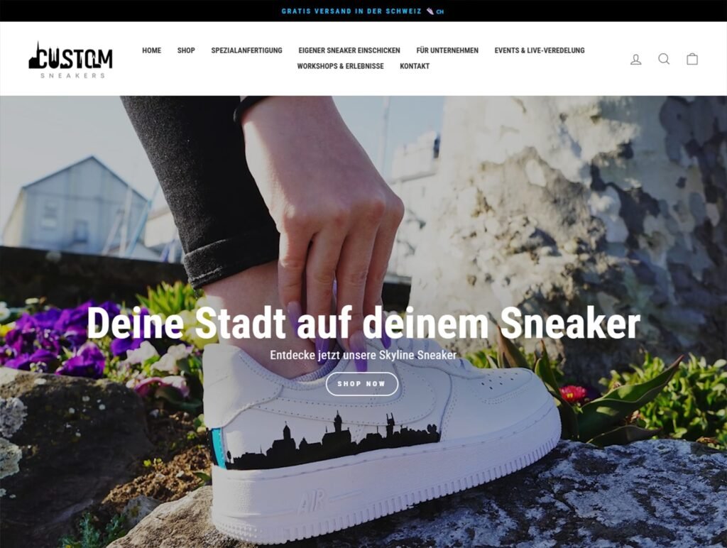
There’s a story most eCommerce brands know all too well. The website looks sharp. The products are compelling. Traffic is coming in, visitors are browsing, even spending time exploring. But somehow… sales just aren’t happening. That’s exactly the situation this sneaker brand was stuck in.
On the surface, everything seemed right. The visuals were polished, the concept was strong, and the brand had real personality. But somewhere along the customer journey, things were falling apart before checkout. People were interested, but they weren’t convinced.
And that gap matters. For a newer brand, especially one selling bold, identity-driven products like custom sneakers, good design isn’t enough. You don’t just need attention; you need trust. You need to make first-time visitors feel confident enough to buy.
That missing piece? Trust.
And that’s exactly where Error Sync stepped in to turn things around.
The Numbers:
- Started at: 6–10 orders/day (Facebook DMs only)
- After social campaigns: 8–14 orders/day
- With Shopify store: 25–32 orders/day (regular months)
- Peak season: 45–60 orders/day
Project Details
The Gap Between Interest and Action
Low conversion is one of those problems that is easy to misread. The instinct is often to chase more traffic, run more ads, or tweak the design. But this brand did not have a traffic problem. It had a trust problem. Visitors were showing genuine interest and then dropping off. Not because the product was wrong, but because the website was not giving them enough reason to feel confident about the purchase. The reviews were underused. The product pages were not answering the questions a hesitant buyer would naturally have. The path from "I like this" to "I am buying this" was vague. And for a newer brand without an established reputation to lean on, vague is expensive. Every unanswered question, every missing trust signal, every unclear next step quietly chips away at the likelihood of a sale.
Rethinking the Whole Approach
The brief was not to make the site look different. It was to make it work better. Error Sync came into the project asking a different question than most agencies would. Not "how can we make this look more premium?" but "what is actually stopping people from trusting this store enough to buy?" That shift in framing changed everything about the strategy. The work focused on three things: building credibility, improving how the products were communicated, and making the buying journey easier to follow.
What Was Actually Built
Trust had to be earned on the page itself
For an established brand, trust is borrowed from reputation. For a newer one, the website has to do that work directly. Error Sync restructured how social proof, reviews, and reassurance messaging appeared across the site, making credibility visible at the moments when a visitor’s confidence was most likely to waver. The store stopped feeling like a product listing and started feeling like a brand worth trusting.
The product pages needed to tell a story, not just show a photo
Sneakers, especially custom or design-led ones, carry a concept. That concept needs to come through in how the product is presented. A plain image and a price is not enough. Error Sync rebuilt the product page experience to communicate value more clearly: what makes the product worth it, what the process looks like, what the customer actually gets. When visitors understand what they are buying and why it matters, hesitation drops.
The path to purchase was made obvious
This is the piece most sites get wrong quietly. The design looks fine, but the next step is never quite clear enough. Where should someone go after reading the product description? What happens if they want to learn more before committing? What is the actual call to action, and is it positioned where attention already is?
Error Sync mapped the conversion flow and rebuilt it with more intention. Clearer prompts, better sequencing, less room for a visitor to wander off without direction. Not aggressive, just clearer.
The Shift That Followed
Before this work, the store was relying almost entirely on its visual appeal to carry visitors through to a sale. That is a fragile strategy. First impressions bring people in. Credibility and clarity are what convert them.
After the rebuild, the store had both. The visual identity was still there, but now it was backed by a structure that actually supported the buying decision.
Add-to-cart rates improved. Bounce rates dropped. Visitors were spending more time engaging with the content rather than leaving quickly. And crucially, the store was now in a position to benefit from paid traffic in a way it simply was not before, because traffic without a converting website is just an expensive way to grow your bounce rate.
What This Brand's Story Actually Illustrates
The temptation in e-commerce is to treat conversion problems as design problems. And sometimes they are. But more often, especially for brands in their earlier stages, the real issue is trust.
Customers are not loyal to brands they do not know. They need signals. They need to see that other people have bought, been happy, and come back. They need product pages that answer their actual questions. They need a checkout journey that does not make them second-guess anything.
None of that is about aesthetics. It is about psychology. And building for buyer psychology is a specific skill, distinct from building for visual impact
How Error Sync Approaches This Kind of Work
The goal is never just to make a site look more current. The goal is to make the site earn its place in the sales process. That means understanding why visitors hesitate, what builds confidence at each stage of the journey, and how to structure content and flow so the path to purchase feels natural rather than forced. For this sneaker brand, that meant turning a site people admired into one they actually bought from.
The Short Version
This brand wasn’t lacking potential, it was missing alignment. The product was strong, the vision was clear, but the website experience didn’t live up to either. And that disconnect was costing them sales.
Once that gap was fixed, everything changed. The store went from being a place people casually browsed to one they actually trusted enough to buy from.
That’s the real impact of a conversion-focused build. It’s not about flashier visuals or louder design. It’s about creating a seamless, confidence-building experience that quietly does its job, turning interest into action.